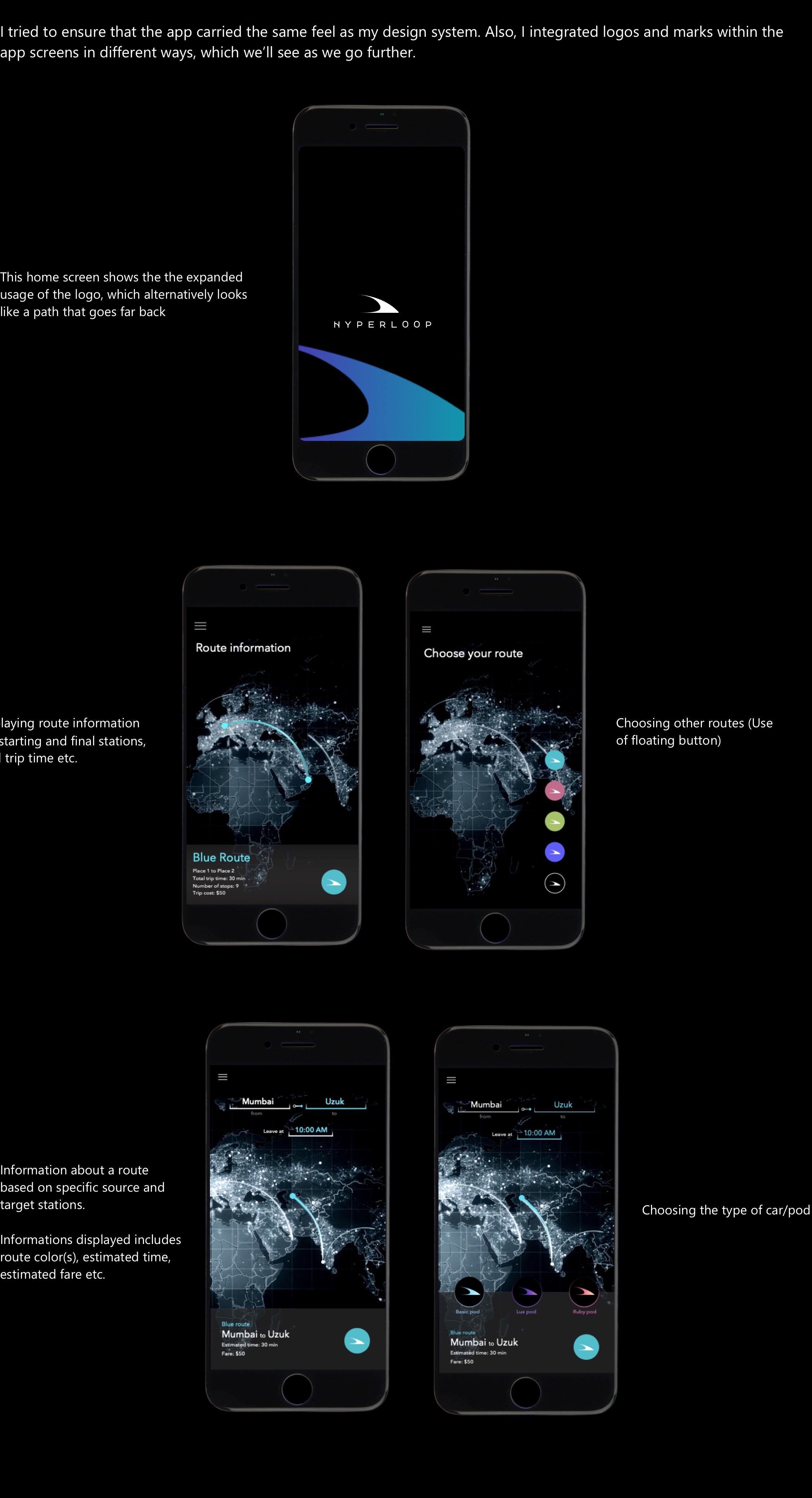
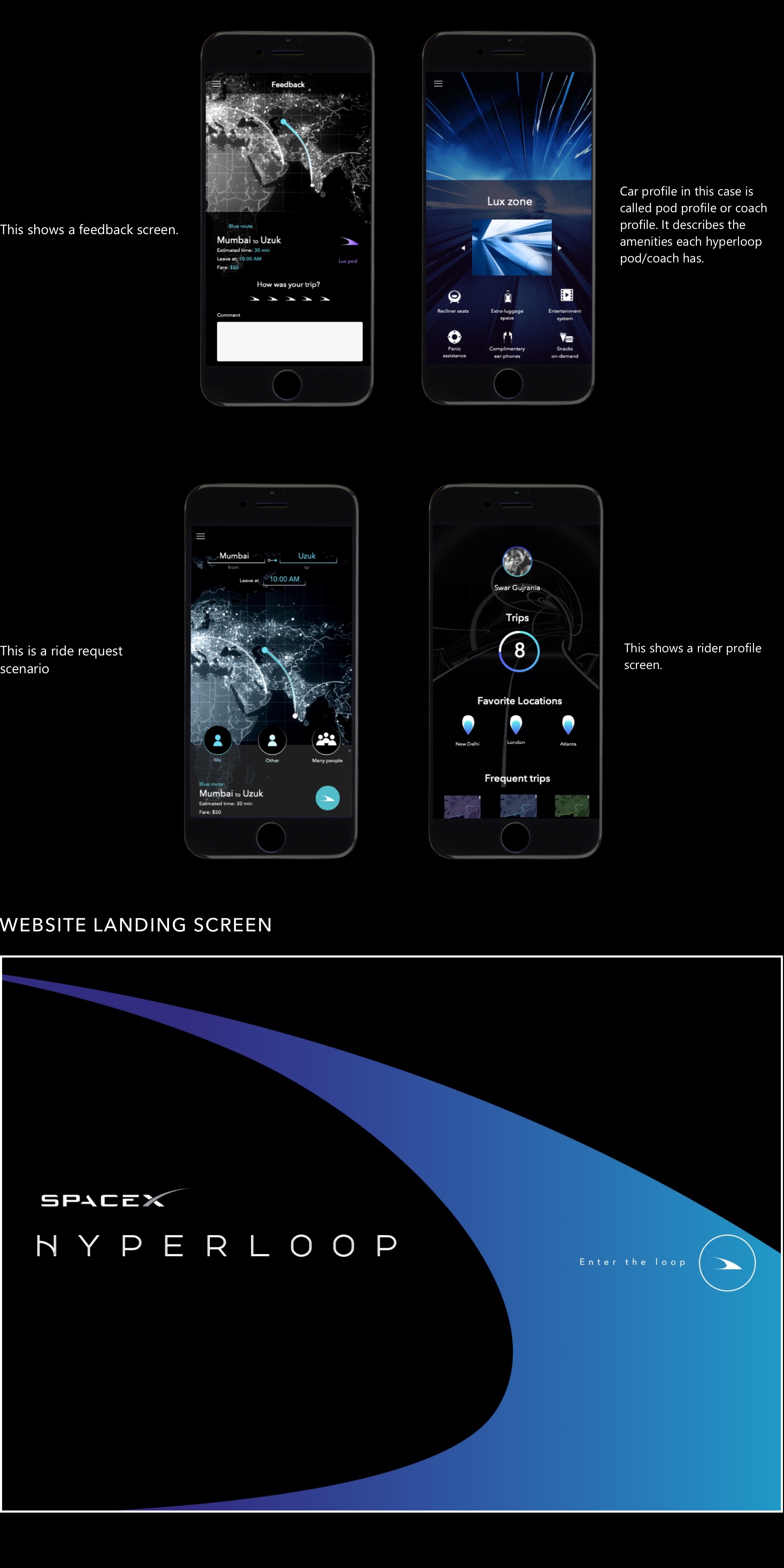
loading

Hyperloop

Visual exploration of SpaceX's Hyperloop

Hyperloop Project Summary: This project aims at visualizing, and designing a cohesive identity system of a mobile application that, in future, will be used by people to book their rides in SpaceX’s Hyperloop.  The design is speculative and the theme for this project centers around the idea of future. It aims to communicate the ideas such as speed,  future, scientific nature and precision.


IDENTITY SYSTEM


Identity System: Color Palette. Inspired by the bluish-indigo flame that is associated with high energy combustion engines (as that of the rocket), I chose the following color palettes. Black and white are primary colors, but I explored different options in terms of accent/highlight colors. Identity System: Typography


APP SCREEN DESIGNS


I tried to ensure that the app carried the same feel as my design system. Also, I integrated logos and marks within the app screens in different ways, which we’ll see as we go further. I tried to ensure that the app carried the same feel as my design system. Also, I integrated logos and marks within the app screens in different ways, which we’ll see as we go further.


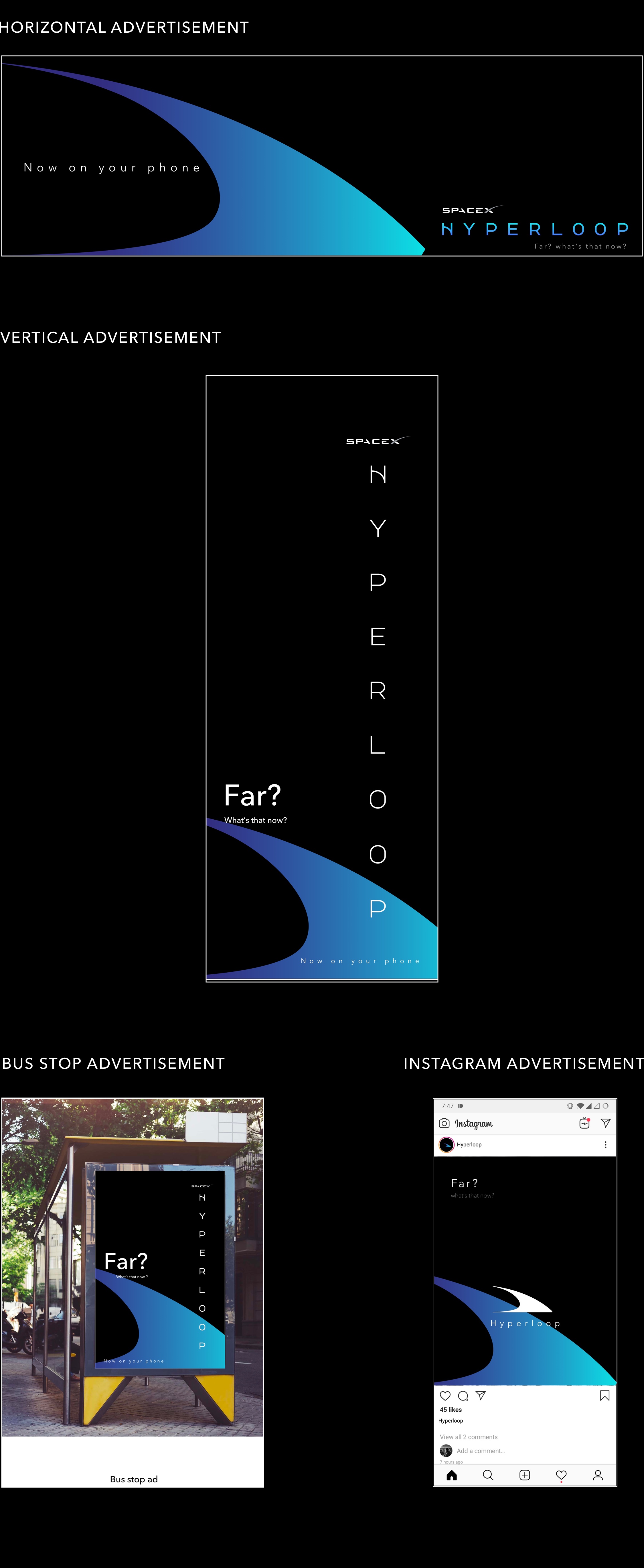
COMMUNICATION MATERIAL


Mockups for different kinds of advertisements